Mistake #1:

Relying on the colors on your screen
This photo of computer monitors for sale at BestBuy shows how each t-shirt appears to be a different color when viewed on different brands of computer monitors. The same is true for televisions and displays on mobile devices.
These other factors can also cause the colors you are viewing online to appear different than they would in person:
- The age of your monitor or mobile device
- The angle of your screen
- Using a privacy filter or scratch guard
- How warm your monitor is
- The resolution of your screen
- The resolution of the photo
- Ambient light around your monitor or mobile device
- Red-green balance settings
- Brightness and contrast settings
Mistake #2:

Relying on photo studio lighting
Most product photos are taken in a photography studio with neutral lighting and editing that attempts to mimic the even white light of the noon day sun. Lighting conditions that exist in your home can influence the color of your furnishings as well as your mood. Natural daylight is affected by the direction of your windows and the time of day.
As the sun sets, west and south facing windows let in light that grows steadily warmer in color throughout the day. "Warm" colors are sunset colors like gold, orange, and red. If your room has west or south facing windows, or incandescent light bulbs, the colors of your furnishings may appear to be slightly darker. These light sources tend to be more "dim", with a gold or red tint. Blue and green colors may appear more muted under this lighting.
Sources of cooler light include north facing windows, fluorescent bulbs and some LED lights. Lighter, muted colors such as pastels may appear washed out under cool lighting, while greens and blues may be enriched.
Mistake #3:
Relying on the wrong background
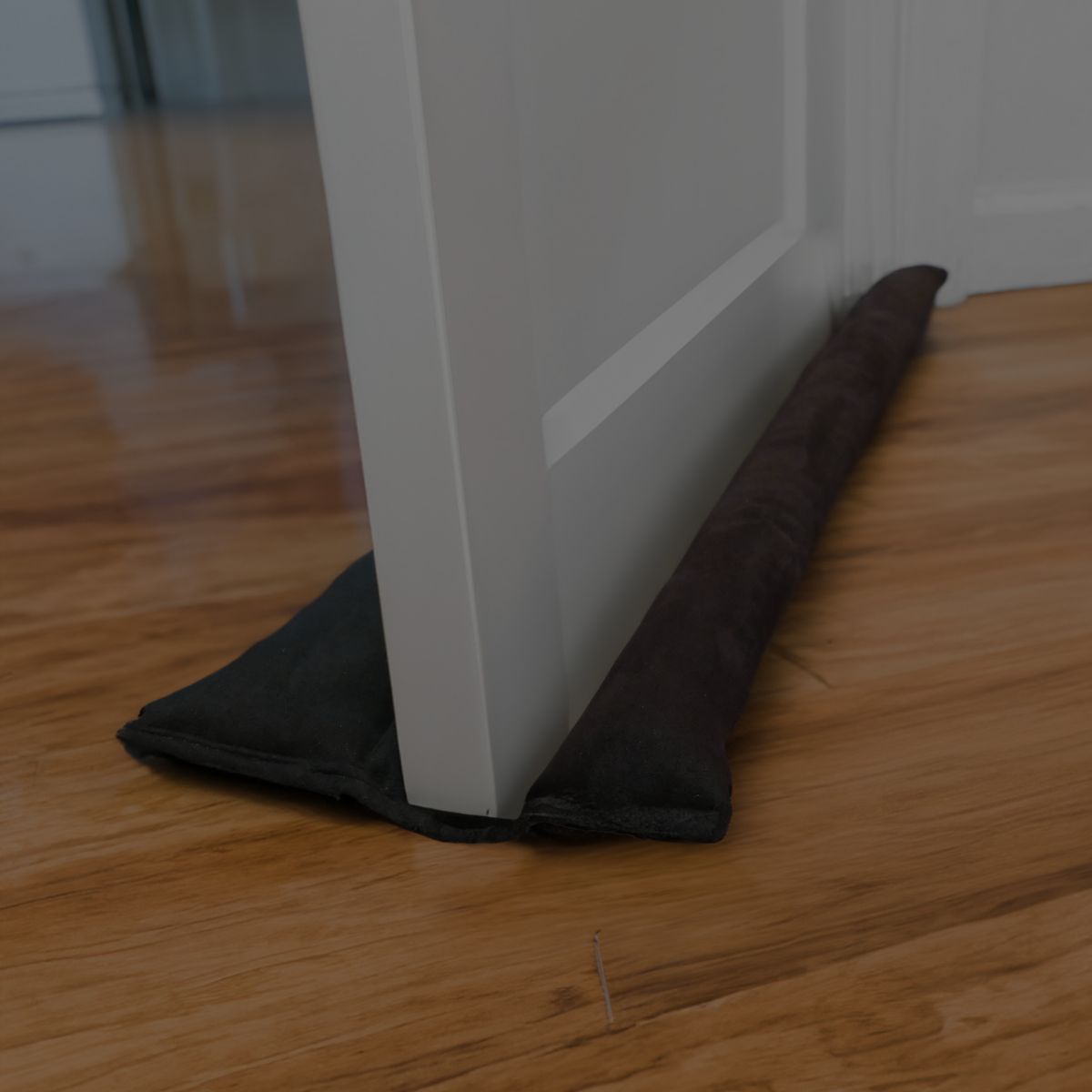
This person sliding a grey square of paper across a shaded background shows how the same shade of grey can appear darker or lighter depending on the surroundings. This isn't CGI -you're just seeing how surrounding colors can powerfully influence our perception of color. When you view a product photo online it is typically shown against a white background. But your walls, window coverings, flooring & other furnishings will influence how the color of your cushions appear when you get them home.
Mistake #4:

Relying on descriptions of colors
Shoppers on sites like Amazon.com frequently try to ask other customers, "Can someone who bought these tell me what color it was when it actually arrived?" But if another customer described it as cornflower blue, how do you know which shade of blue they're thinking of when they say cornflower blue?
Check out the comments section on BuzzFeed's Great Crayola 64 Quiz of Impossibility, and you'll see that people can't agree on which shade of blue should be named Cornflower, which shade of brown should be called Mahogany, or which shade of pink should be called Carnation.
If that's not scientific enough for you, an MIT alum published an analysis of color dictionaries used by organizations such as paint manufacturers and web designers. The analysis showed that even groups who are trying to standardize colors for industrial or commercial use have failed to produce a consistent system for identifying colors with words.
To further complicate matters, some languages have no color words to describe colors which are considered common in other languages. So if you asked an English-as-a-second language person to describe a color, they might give you a surprising answer. For example, in the Japanese language, the color words for green and blue are interchangeable, so a Japanese person might tell you that the "blue" light on the traffic signal means "go".
Mistake #5:

Relying on a brand name for a color
Now that we know that industrial and commercial organizations can't agree on which word best describes a color, perhaps it should come as less of a surprise that you could buy a "cornflower blue" product from several different brands and end up receiving 4 different colored products.
So which of these brands gave you an inaccurate product description? None of them. A description like "ocean blue" might evoke very different images for someone who lives on the Pacific coast compared to someone who lives in the Caribbean. Neither would be "wrong". Some brands try to avoid this predicament by identifying colors with numbers instead of names. Or by using names that are so abstract they don't really mean anything to anyone, like "Spirit Whisper" or "In Your Eyes". But in most cases, you can treat a product name like a ballpark estimate, it might get you close, but you wouldn't expect it to be exact.
Mistake #6:

Relying on what other people see
Some people are pitch-perfect singers, while other people couldn't carry a tune in a bucket. Just like natural singing ability, people have varying degrees of color vision. In 2015, two social media trends dramatically illustrated just how different our color vision can be. #TheDress polarized viewers who saw white and gold instead of blue and black (a phenomena attributed to strange lighting). #TheShoe functioned as a spontaneous test that lumped viewers into three categories:
- Those who cannot tell there are two different colors of nail polish
- Those who can tell there are two different colors of nail polish, but can't tell which color is a closer match to the shoe
- Those who can tell there are two different colors of nail polish, and can tell which is a closer match to the shoe
There are more extreme variations in color vision, like people who are color-blind, or people with the super-human ability to see ultra-violet, but you're more likely to encounter a person who can't detect the difference between similar colors, such as a person who can't tell the difference between fuchsia and violet. Medical conditions such as poor blood circulation, or pre-cataracts, can also affect color vision, especially for older individuals. These individuals may think a color is darker, or is tinted yellow, red or brown.
Mistake #7:

Relying on dye lots to be the same
Fabrics and yarns are dyed in batches known as "dye lots". Batches do not always turn out the same, even at big industrial mills. The heat, humidity & other conditions on the day the yarn was dyed; drought, freezes & other climate conditions as the natural fibers were growing, and other factors, can cause dye lots to turn out different. Synthetic fibers, synthetic dyes, and modern production standards may lessen dye lot differences to some degree, but buyers are expected to know that different dye lots can not be guaranteed to be the same. A manufacturer can easily sell out of a dye lot in a week, or even overnight if a product gains unexpected popularity.
The Solution:

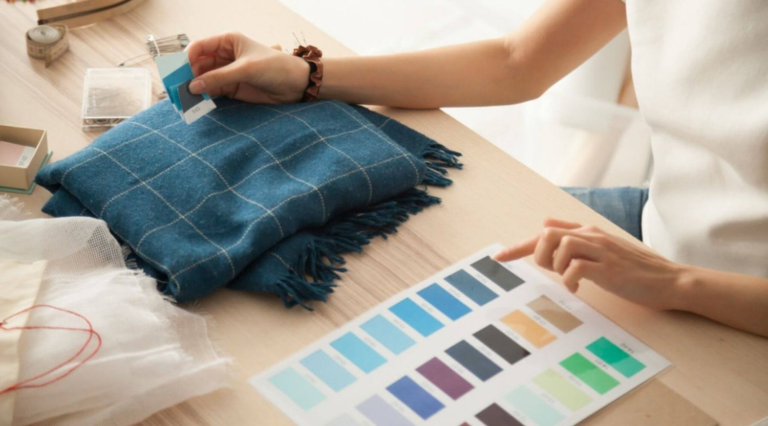
Request fabric swatches
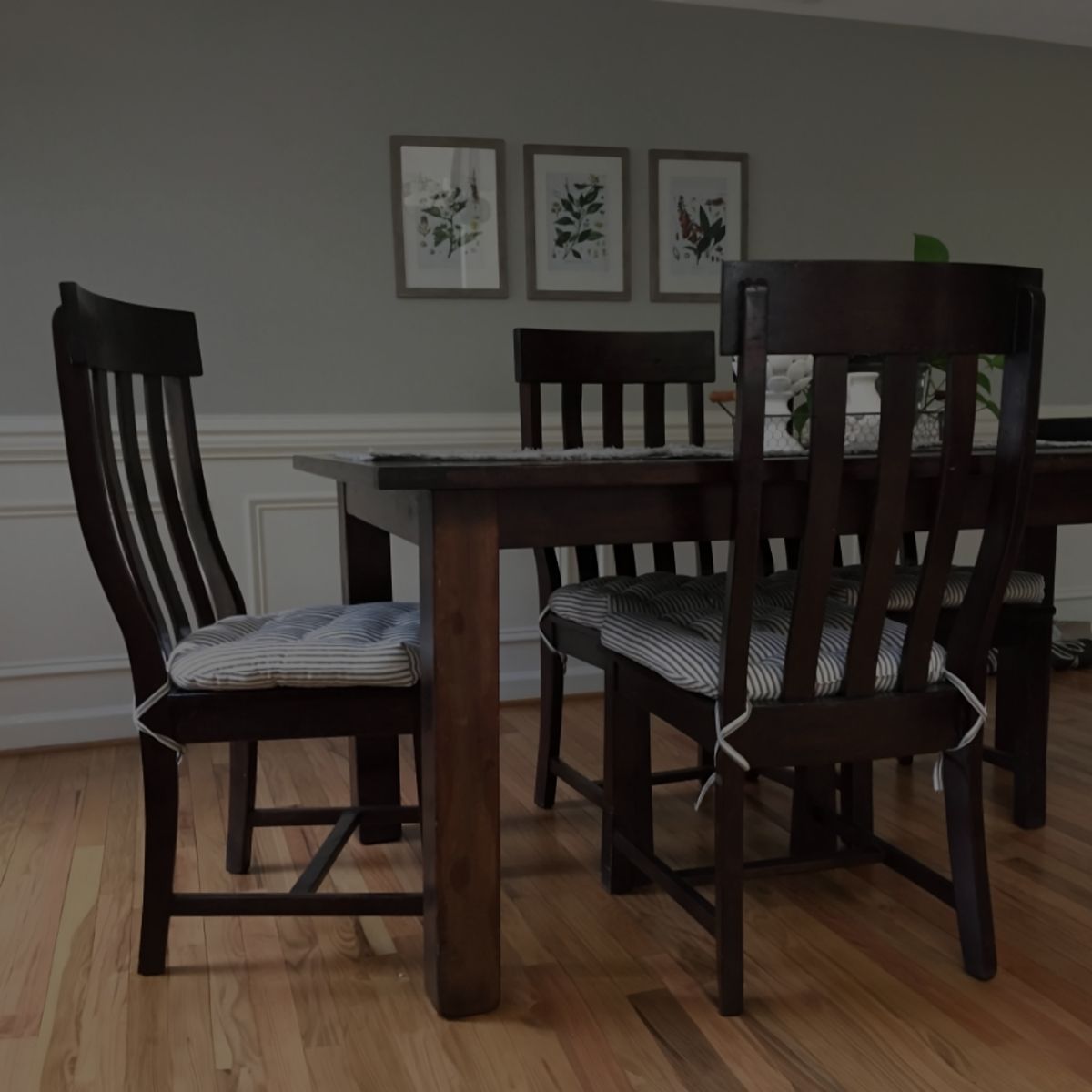
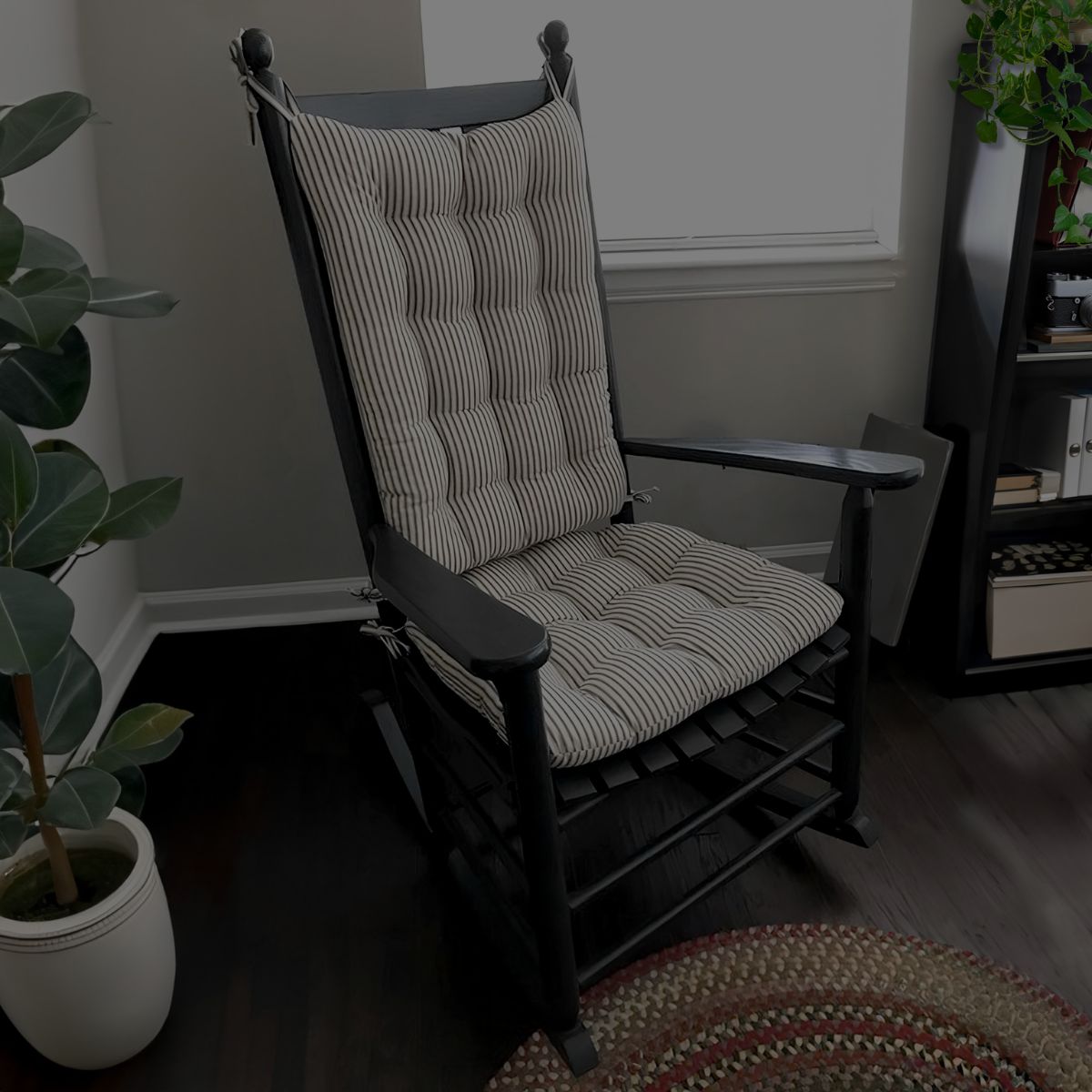
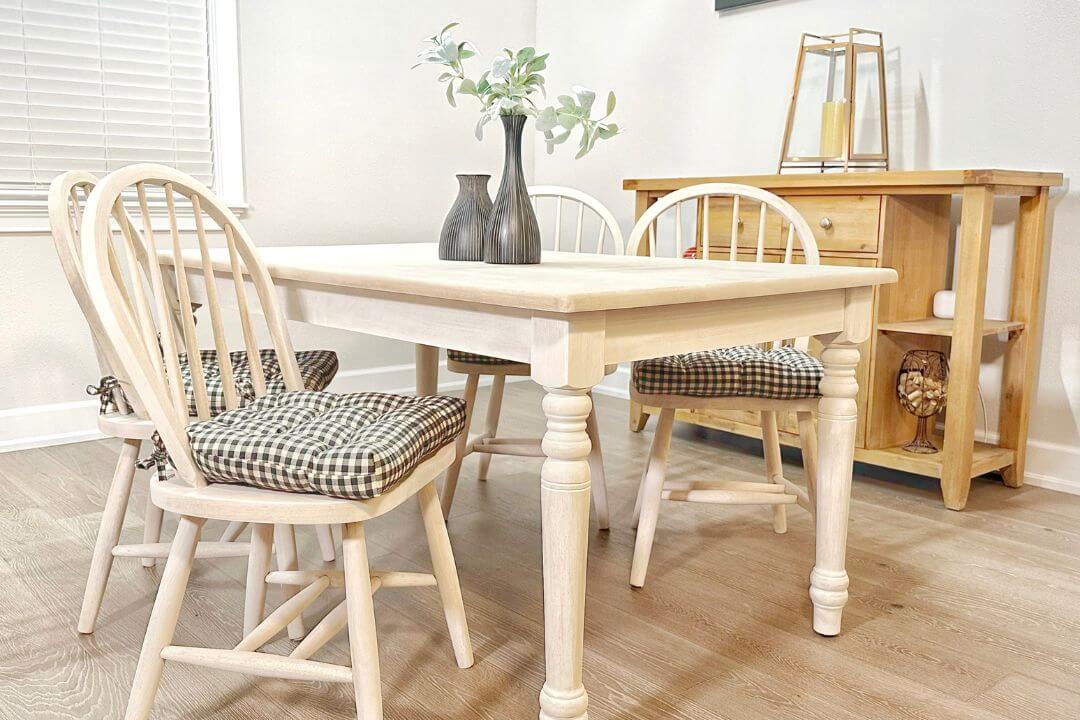
Before you order home decor online, request fabric swatches from the manufacturer or seller. Fabric swatches are typically free, or cost very little, but can save you quite a bit of time and trouble. If you're purchasing cushions, place the fabric swatches on the chair so you can see how they will look next to the surrounding colors and under the ambient lighting. Invite the other residents in your home to take a look too, they might see things a little differently! Consider ordering enough cushions for the set all at once, plus a few extras for replacements.
Click here to get up to 5 fabric swatches for free!